Underrated Wedding Color Palettes
"In nature, light creates the color. In picture, color creates the light."
- Hans Hofmann
What do I wish my clients (and all brides) knew about color?
Color plays an incredibly important role in your wedding design.
You don't just have to choose two. In fact, you should be selecting an array of shades, hues and tints to compliment each other in a larger palette.
Your wedding color palette sets the mood from as early on as your invitation suite. Go dramatic and regal with jewel tones, intense contrast and darker hues. Highlight gentle romance with neutrals and pastels. Make it a party with an array of bright, fruit-inspired secondary colors.
Think seasonally! Don't shy away from your favorites simply because of date but know that a strong autumn palette won't capture well in spring light.
Nothing has to "match". Your palette should be a guideline - not a rule.
I want to encourage you to think beyond the standard two color swatches and create an overarching color design for your wedding day (instead of one where the bridesmaid's dresses, napkins and bouquet wraps are all the same exact shade of neon teal).
I'm sharing with you some of my favorite underrated, underused and totally gorgeous wedding color palettes today along with some tiny tips on how to implement them throughout your design from your invitation suite to florals to attire to reception decor.
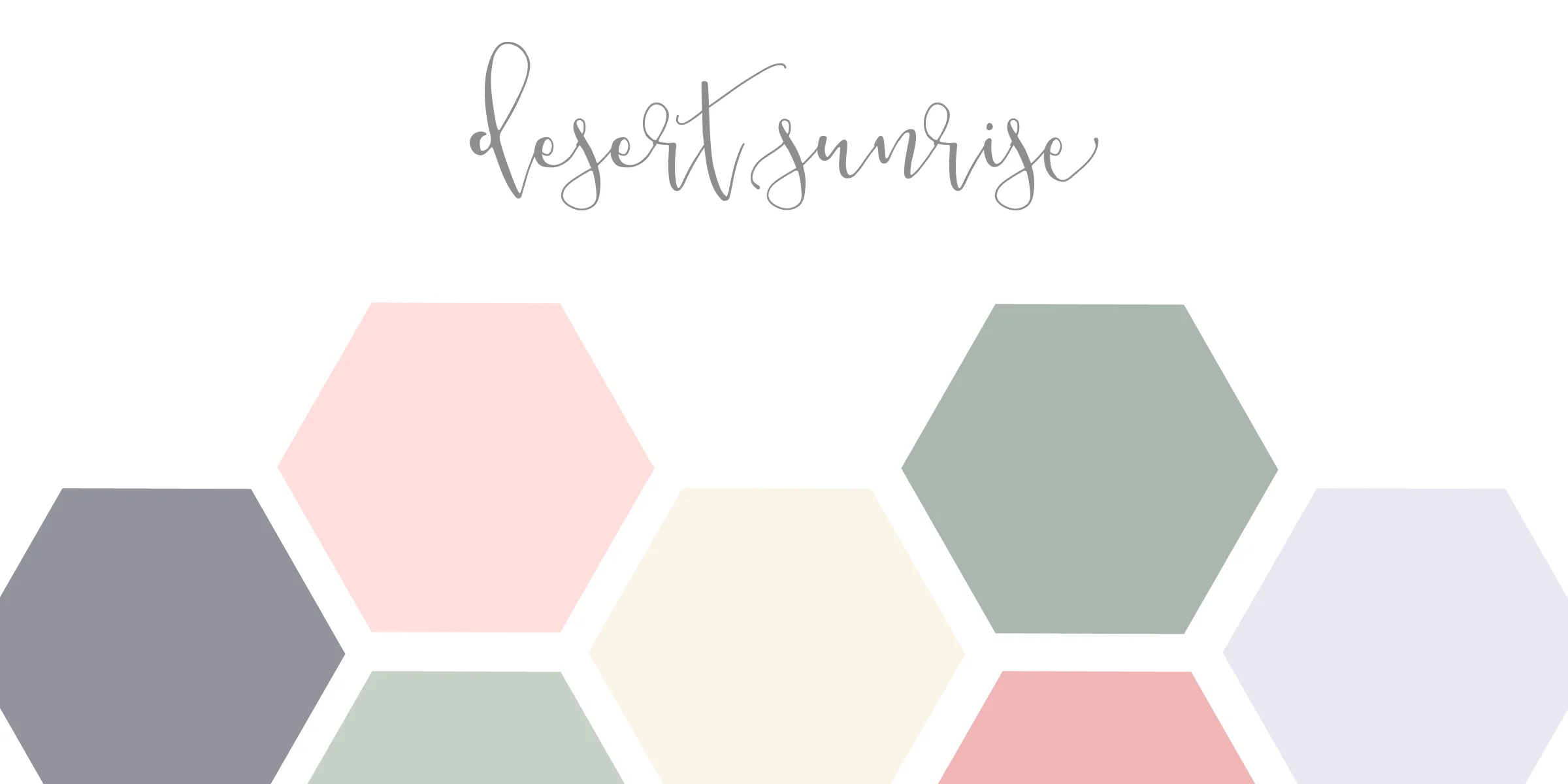
A muted pastel earth-toned palette that goes beyond browns and greens
to capture the spirit of timeless beauty.
A FEW TIPS ON IMPLEMENTING THIS PALETTE IN YOUR DESIGN:
With this palette I envision a heavy use of cream colors and linen textures - along with some complimenting natural wood. Bridesmaids could be in sage green and/or light lavender with greenery bouquets containing a touch of blush ranunculus and white stock. Cream reception linens with light peach napkins complimenting long, low succulent centerpieces would tie the design together.
A bold and fun summer palette made to perfectly suit the bright, modern and trendy
bride and groom.
A FEW TIPS ON IMPLEMENTING THIS PALETTE IN YOUR DESIGN:
This color scheme is just crying out to be used! It is inspired by summer citrus fruits which could be incorporated into the overall event design (think glass water decanters with delicate sliced limes, lemons, strawberries and mint). The florals for this palette would be multicolored, bright and very memorable. I envision white sequin tablecloths scattered with mercury glass votive candle holders. Bridesmaids in (rarely seen but totally beautiful) yellow combined with groomsmen in kelly green bowties would complete this look!
A palette that's all about the way light plays on water and the gorgeous tones of the mediterranean in summertime.
A FEW TIPS ON IMPLEMENTING THIS PALETTE IN YOUR DESIGN:
I would say that white and a delicate light blue are the two primary tones in this design. I close my eyes and picture a bride in her white gown holding a cascading bouquet of white roses and eucalyptus - adorned with streams of blue silk ribbons that hang down to her knees and blow with the breeze. Keeping this palette soft while still being adventurous is key. Rely heavily on those blue sea tones while incorporating pops of blood orange / dark coral into the design (perhaps as a signature cocktail, the brides shoes or the cake).
An effortlessly romantic color scheme that feels incredibly fancy without being stuffy.
A FEW TIPS ON IMPLEMENTING THIS PALETTE IN YOUR DESIGN:
This color palette feels similar to Desert Sunrise but rather than peaches and lavenders, we're focusing more here on french blues and soft blushes. More neutral whites and light grays will also be prominent in this design (rather than the creams of Desert Sunrise). Bridesmaids in a light french blue or a mixture of a few different shades of grey-blues would be beautifully complimented by a bouquet of blush anemone, soft pink peonies and white astilbe. White tablecloths with delicate sage green linen napkins or... for the more adventurous... floral patterned tablecloths with a white napkins would both be incredibly gorgeous.
A palette inspired by the endless shades of green across the Irish countryside
with a sprinkle of drama.
A FEW TIPS ON IMPLEMENTING THIS PALETTE IN YOUR DESIGN:
This is probably one of my favorite color palettes. There's usually a fair amount of green to capture on a wedding day thanks to the florals but woooooaaaah whenever there can be more jewel-toned greens in a design, I'm a happy camper. This is truly a "cannot go wrong" classic, dramatic color scheme. I suggest the bridesmaids (and even the groom) wear emerald green complimented by soft touches of gold jewelry. The reception is where this palette can really shine. White table linens with metallic gold plate chargers, gold centerpieces with all white florals and flickering candles in tall gold candelabras. If you're feeling adventurous, add a black and white striped table runner or hot pink peonies into the floral design. I would recommend starting this one off strong by sending your guests an emerald green invitation with white lettering. They'll be wowed from the start.
Inspired by the oil on canvas, this hopelessly romantic palette incorporates intense contrast and gives off a celestial vibe.
A FEW TIPS ON IMPLEMENTING THIS PALETTE IN YOUR DESIGN:
The most popular color of bridesmaids dresses (and in turn, groomsmen attire) is navy blue. For the bride who dreams of this - Starry Night is a perfect palette. However, I challenge you to consider light grey or gold sequin wedding party attire instead. Dare to be different. I love this color scheme for a few reasons but the first is because it's easy. Darker shades of blues and blue-greens are easy to incorporate into wedding design in many ways. Because this palette is on the heavy and darker side, it feels more fitting for a winter or evening black tie wedding. Gold lanterns with large candles surrounded by a floral wreath would make for the most perfect centerpieces on navy tablecloths (bonus points for gold chiavari chairs!!!!).
A bright, unapologetic, incredibly memorable and underrated palette for tropical vibes reminiscent of Lilly Pulitzer.
A FEW TIPS ON IMPLEMENTING THIS PALETTE IN YOUR DESIGN:
I saved this for last because not only is it incredibly similar to my own wedding palette, it's my absolute favorite and by far the most fun. The key to nailing this color palette is through an abundance of lush, bright florals and not being afraid to play with patterns. Floral bridesmaids dresses, patterned bowties and fun shoes are a must! Bring in those upscale, coastal Palm Beach vibes by setting a formal dress code and choosing a mix of table shapes for your reception. Gold sequin tablecloths and tall palm centerpieces will floor your guests and leave them speechless. Bring the ocean inside with teal accents incorporated very subtly - like monogrammed cocktail napkins, shiny shoes for the bride or macarons in clear boxes as favors.


